Products You May Like
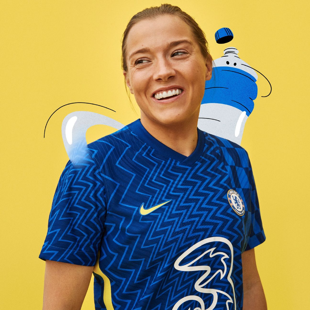
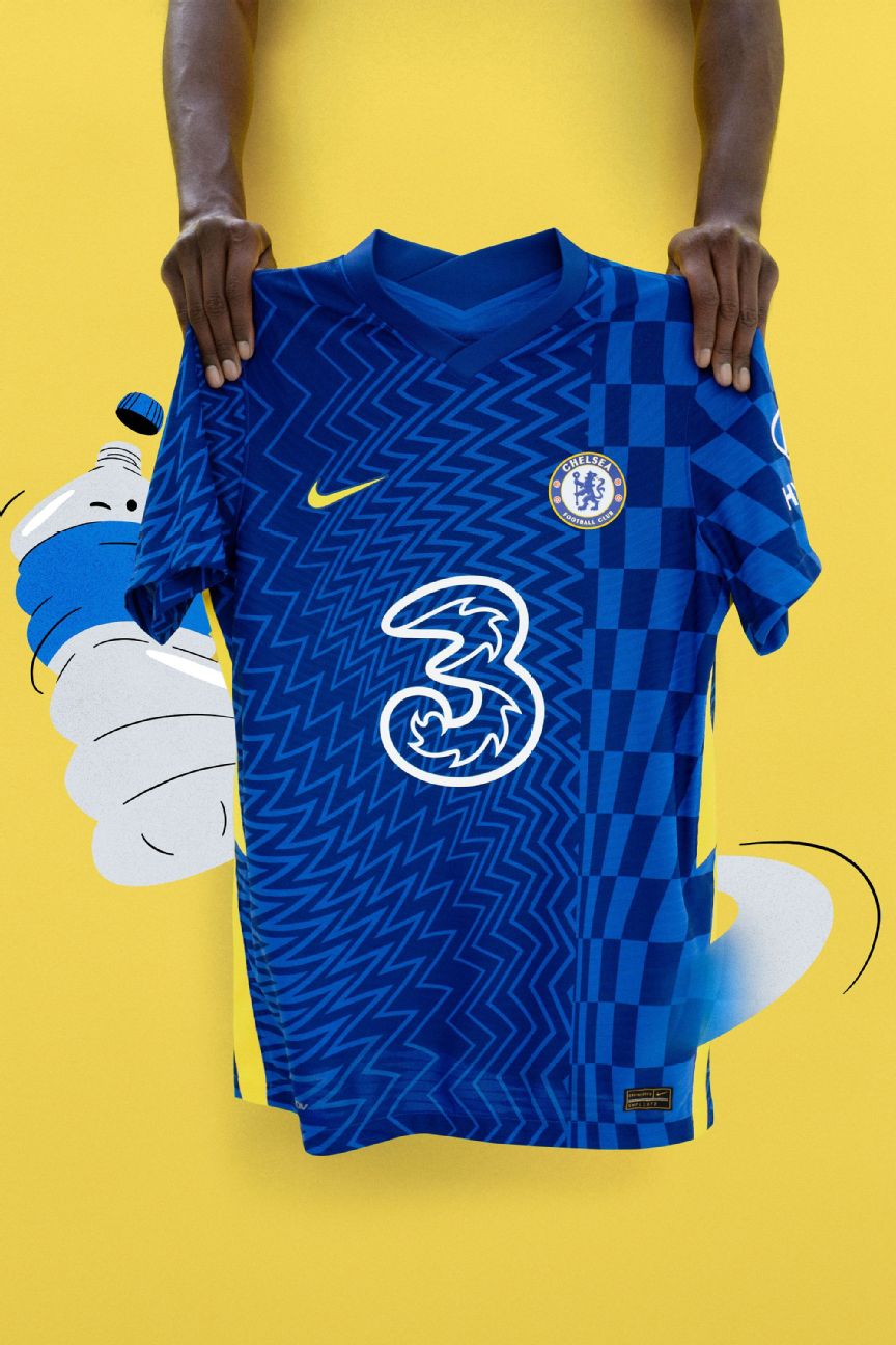
Chelsea have revealed their brand new home kit for the 2021-22 season, inspired by the changing face of London during the 1960s.
It will be worn by the men’s team for the first time on May 15 when they face Leicester City in the FA Cup final at Wembley, and back-to-back Women’s Super League champions Chelsea will also showcase the kit when Emma Hayes’ side face Barcelona in the Women’s Champions League final on May 16.
– FA Cup final: Stream LIVE 5/15 at 12 p.m. ET on ESPN+ (U.S. only)
Thomas Tuchel’s side are technically the “away” team when they come up against Manchester City in the all-English Champions League final on May 29.
The colours they will where for that showpiece are yet to be confirmed, although both teams wore their home kits with their differing shades of blue when they met in the Premier League earlier this month and in their FA Cup semifinal back in April (stream the replay on ESPN+ in the U.S.).
Manufacturers Nike say that the strip, modelled by stars Mason Mount and Fran Kirby, is directly inspired by London in the swinging Sixties — a time when bold leaps were being made in music, culture, and fashion. As such, the shirt boasts a more vibrant blue base colour that usual, along with a jumbled abstract pattern that pays homage to the Op Art (optical art) movement popularised in the early 60s.
It’s that time of the season. 🔊👕
Introducing our new 2021/22 @NikeFootball home kit. Inspired by the 60s, but as fresh as they come 🔥 ft. @TheZombiesMusic#ItsAChelseaThing #ThePrideOfLondon pic.twitter.com/aPpMtgcdJF
— Chelsea FC (@ChelseaFC) May 13, 2021
Preeminent Op Artists such as Victor Vasarely and Bridget Riley created stark geometric designs intended to fool the eye and give the impression of movement [insert harsh joke about Timo Werner here].
The 2021-22 Chelsea kit seeks to harness the same sense of energy and vibrancy, with the mesmerising print supposedly serving as a visual metaphor for the impetus offered by club’s “new wave” of talent.

“This jersey is the most eye-catching yet and is so unique from the others I’ve worn,” Mount said. “I think it’ll be a big hit with Blues across the globe.”
The mesmerising Op Art print is continued onto the shorts, while the accompanying white socks feature the same bright yellow trim that speckles the rest of the strip.

The Blues have made a habit of rolling out their “next year’s” kit before the end of the current season in recent years. Indeed, the strips they wore in both of their previous Champions League final appearances were mere weeks old — and the omens are mixed for the men’s team.
The home kit Chelsea wore to face Manchester United in Moscow in 2007-08 was unveiled just 18 days prior, though it mattered little as Avram Grant’s side were beaten on penalties at a rain-lashed Luzhniki Stadium.
Then again, the strip worn by the Blues in the 2011-12 final against Bayern Munich was only four weeks into its lifespan when Didier Drogba and company eventually emerged victorious to lift the trophy at the Allianz.
Perhaps it’s worth noting there are only 17 days between the launch of the Blues’ new 2021-22 kit and their big date with Man City in the 2020-21 Champions League final at the end of May.
This kit could be a firm Chelsea favourite before next season even begins.
