
Products You May Like
It’s a new year in MLS, which means new kits.
All 30 teams got a new jersey, with San Diego FC getting two of them for their expansion season and Inter Miami getting a fresh pair too because, well, that Lionel Messi guy sells lots of shirts.
As has been the case since 2006, Adidas is the supplier for every club in the league and the designs are subject to the manufacturer’s template. Adidas’ template this year has shades of its look from the late 2000s, and it’s not the easiest to work with, as some teams found out.
Who’s looking hot, and who’s not? Let’s rank all 30 clubs’ new threads.
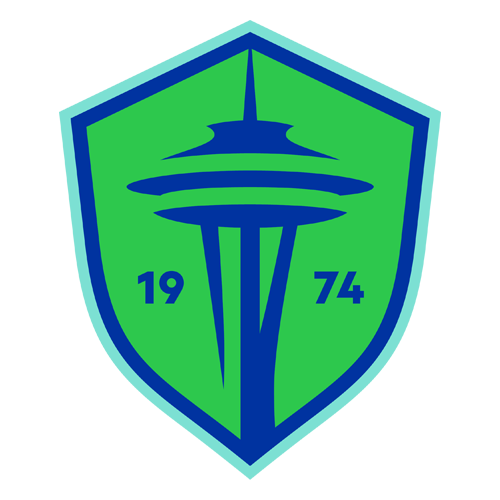
Look who it is again.
A year after landing in the top spot with a dazzling home kit, the Sounders are back with a secondary kit to match. The deep blue isn’t just handsome, it’s also novel, as Seattle turns to a dark blue secondary strip for the first time as an MLS team. The design, which comes from three Salish women and the local weaving traditions, gives the kit texture and depth for a classy and distinctive look.
The Sounders have done a spectacular job since refreshing the brand prior to their 50th season last year and it shows up again here. The kit is inspired by the Puget Sound and feels distinctly Seattle, with their revised, minimalist Space Needle crest fitting in well. Even the sleeve sponsor feels right at home.
Between this kit and last season’s green offering, the 2025 Sounders may have the best set of kits in MLS history.

The Timbers are celebrating their 50th season in style. The deep green and gold is always a sight to behold, and the restrained design on this kit really lets the colors sing. The only real design element is the rings of the tree, which encircle the crest and act as both a perfect representation of the city and brand, as well as a memorable hallmark of this golden anniversary kit. Hell, even the Tillamook logo fits the vibe of the kit perfectly.
There is only one thing keeping this kit from the top spot: the Timbers didn’t alter the colors of the crest to match.

Cream-colored kits rarely work, but this is absolutely one of the few that do.
Coming off of the long-anticipated and much-lauded cherry-blossoming secondary kit, D.C. had to hit with this one and they did just that, tapping into the city’s funk and soul history for a colorful pattern that looks gorgeous. And while you’d often see that all over the shirt, United opted for some restraint and used the Adidas template to their advantage by working the pattern in there. It works to perfection, turning a cream kit into one where the cream exists to put the spotlight on the bright accents.

After years of tired navy kits, the Galaxy finally turned their secondary look into something worthwhile in recent years. They leaned on green, as an homage to their early kits, and it worked stupendously, and now they’re branching out from there with a purple shirt that looks exquisite.
Meant to look like a sunrise, the Galaxy have found a brilliant shade of purple that fades into blue at the top and pink at the bottom. It’s striking and the gold accents work perfectly. Call it a nod to the Lakers if you want, just call it lovely, too.
It’s difficult when you wear white at home because, as clean as it may be, it can only be so exciting, which means the secondary shirt then has to really pop. The Galaxy are now doing that each time out, with this latest edition another absolute hit.

A checkered kit in MLS? It’s a brand new day and RSL deserves credit for their bravery. It’s a smart look, taking their fairly innocuous secondary colors of blue and white and turning them into a kit that will be remembered for a long time.
While this kit is all about the checks, don’t forget the red three stripes and gold sponsor across the chest. Despite using a design that they (and the rest of the league) don’t touch, this is a kit that still feels very much like an RSL kit. That’s not easy to do, but they did it.

There might not be a team in MLS with as identifiable of a kit as the Whitecaps. When you see white with a horizontal navy stripe, you know it’s Vancouver, and it’s gorgeous for good measure.
This season is one of the Caps’ better editions of that beautiful home kit, as they use light blue accents perfectly and the Telus logo fits the entire look as well as any sponsor could. The Whitecaps are going to look great at BC Place, as per usual.

In a season short on bold, well-executed kits, the Rapids stand out.
For the first time ever, the Rapids dropped their crest for a C that mimics the state flag but has a soccer ball in it. It’s a clever nod that looks superb and feels right at home on a shirt that evokes the state’s snow-covered trees. It could so easily be too much and not work, but it perfectly toes the line of evocative and brash without being overwhelming.
Nail the look and ground it so clearly in your home, and you have yourself a winner.

The last time LAFC had a white kit with gold trim was back in their inaugural season, when it was just a plain white shirt with gold Adidas stripes. Now it’s back, but this time it’s a much more thoughtful kit that really makes the fabulous white and gold sing.
It’s still a simple shirt, but there’s enough gold to give it personality, and the collar doesn’t just fit, it has its own gold flourish that really brings the whole kit together. It’s downright regal.

Behold MLS’ best selling kits of the year.
It doesn’t matter what it looks like, as long as it’s got “Messi” and the No. 10 on the back, it’s going to fly off shelves. That’s why Inter got two new kits this season, but they did deliver with a pair of good looks.
The pink, which thankfully continues to be the club’s primary kit after their initial mistake of using black, uses stripes that everyone is going to see as a nod to Messi’s Barcelona days. The black is nice too, with the split shirt matching the pink stripes as a unique design that is still subtle enough to not dominate the shirt.
All in all, these are two really smartly designed kits, as most any Inter kit is going to be with such a fabulous color scheme. The only problem is that Royal Caribbean logo, which continues to be an anchor on the Miami shirts.
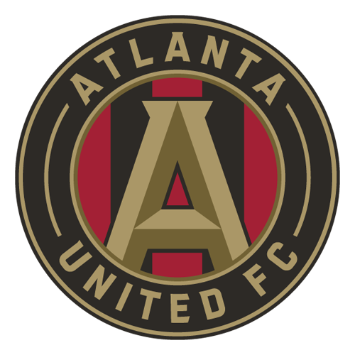
Atlanta have a pretty simple edict with their home shirt: make it red and black stripes. They have a little bonus task of making sure there are five of them, and they nailed that, so this is a good kit.
What separates Montréal from other striped sides is that United have a sharp third color in gold that makes the whole look pop a little better. This kit checks all the boxes, and the only critique is they could have thrown a bit more gold into the mix, maybe on the shoulder stripes.

Montréal will always have a good home kit as long as they’ve got blue and black stripes, so this gets a passing grade off the bat. There’s nothing else remarkable or innovative in the design, but it doesn’t have to be. Not when you have a look that nobody else in the league does. You see this and you know it’s the Impac … err, CF Montréal.
Still, this one makes sure the little details are done right. The white sponsor logo and three stripes match, while the collar trim is a nice touch. More than anything, the details are about getting out of the way of the stripes on this kit, and it does that.

The Loons are working with a great set of fundamentals. They have a great color combination, plenty of Minnesota imagery at their disposal and one of the best crests in all of MLS, so it’s a little disappointing when their kit is anything but a smash hit. This isn’t that, but it is still a nice effort.
The blue looks good as ever with the black, and the collar is a nice touch, even if it’d be better to have it go all the way around to the bottom of the neck. It’d be nice if MNUFC found a way to incorporate a smidge of red somewhere, as a nod to the red eye of the loon in their crest, which is one of the best details anywhere in the league.

Charlotte had a black change kit in their expansion season but quickly moved off of it. Now it’s back, and it’s a really smart design. The black still carries the day, but the subtle pattern gives it a finished look that makes it feel like a Charlotte kit and not just a generic black shirt that so many other clubs wear.
The only criticism is that it could use a little bit more blue. The little bit at the collar just isn’t enough and it feels a little out of place with the white accent marks most everywhere else. Black and blue is a great color combo, so lean into it a little more.

The Union have dubbed this their “Voltage Kit,” and it’s not hard to see why. The light blue and gold looks good whenever Philly turns to it, and this is no exception, plus the minimalist crest with only the snake is a terrific touch. This is a hit from a design perspective, so why isn’t it higher?
For one, the frame of the Thomas’ logo really holds the whole shirt back, but also the electricity inspiration is a bit muddy. The club doesn’t cite Benjamin Franklin in their thinking, but did have Tesla coils at their unveiling, even though Nikola Tesla doesn’t have roots in Philly. It’s too bad Thomas Edison wasn’t from Philadelphia, because an electricity kit with Thomas’ across the front would have hit hard.
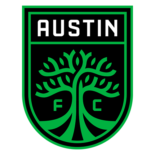
Austin have gone all-in on Verde this season, dropping the black from their stripes and using two shades of green while relegating black to an accent color. It works well, and it will be worth watching whether this is the new normal for Austin or an outlier, with the green and black returning down the road.
One thing that Austin have going for them is a really clear and tidy brand. There’s not a ton of accent colors or imagery. There’s their eye-popping shade or green and black, so they can make any number of kits that feel like Austin FC. This one is no exception.

This might not be the best-looking kit in a vacuum, but it works because it is inspired by Columbus native R.L. Stein’s “Goosebumps” series. It’s meant to look like slime seeping through the black of the shirt and slipping down, which it absolutely does.
Now, is that a little corny? Sure. And that it activates under ultraviolet lights might make you roll your eyes, but when you can ground your kit in one of the most successful products to come out of your city and so clearly evoke that, you’re doing something right.

The Pigeons’ sky blue and white is always going to look good. The question each time out is: How do they make it distinct and feel like an NYCFC kit instead of a generic City Football Group kit?
The easiest way is with splashes of navy and orange, which adorns their crest and gets some love on the collar trim, but it’s not enough. The pattern on the shirt does enough to differentiate it and it’s a nice look, but the Pigeons’ quest for a home shirt that screams “New York” isn’t coming to an end with this one.

Would you look at that, it’s another orange kit for the Dynamo.
As is the case every two years when Houston needs a new primary shirt, they run into a bit of a problem: there’s only so much you can do with this orange. The color is what makes the shirt, and consequently bold designs immediately make the kit overwhelming, so they have to stay simple. This does that, and the bit of blue accents offsets the orange nicely.
Plus, the last time the Dynamo were wearing kits with this type of template, they were playing in MLS Cup. That has to bode well for this year, right?

No need to recoil, Fire fans. The club is not reviving their misguided attempt to make blue their primary color. This is their secondary kit, with red remaining the home choice.
Chicago has shifted toward a lighter blue in recent years, aligning itself closer with the city flag than the navy blue of their first 20 years. This is more of that, and it works, with the subtle pattern giving the kit a touch of class, but the stacked sponsor, with the Carvana logo above the script instead of next to it like on the home kit, clutters things a bit.

As the league’s only purple club, Orlando will always stand out, and they have once again. They went with a bold effect in the design and it helps the kit pop compared to some of their previous offerings, which is nice even if it’s not a smash hit.
However, it would have been nicer if they used more gold as an accent because it is their secondary color and it works so well with the purple. Unfortunately, this continues a theme of the Lions using white on their kits far more often than the gorgeous gold.

No kit was hurt more by this year’s Adidas template than the Revs’. The green is superb and the navy accents hit just right, with the blue and white crest complementing the rest of the shirt excellently.
The problem is the entire design of the kit is awkwardly cut off by the shape of the front panel, undercutting a smart and distinctive pattern of stark lines with a wavy border and not allowing the green to wrap around like it should. If this was a green kit, and not a white kit with a bit of a green front, we’d be talking about one of the league’s best, but instead we’ve got this.

It shouldn’t be difficult for Toronto to have a good home kit. Red and black is a great color combo, they have a sharp crest and their sponsor logo works. Simple, right? Apparently not, because the Reds decided that their last home kit should be gray, and now they’ve gone for an overcomplicated effort that has shades of burgundy and what appears to be orange.
It’s not a good kit and it’s even worse because TFC are inherently set up for success, but at least it’s red(ish). That’s an upgrade after two years in the gray wilderness.
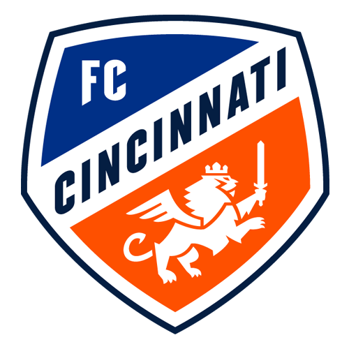
Cincy used a heavy dose of orange on their blue primary kits when they were in USL, but have mostly eschewed their secondary color since making the leap to MLS. That’s not the case anymore, with a gigantic orange diagonal stripe adorning their new kit this season.
It’s nice to see FCC utilize more orange and highlight on a color scheme that is unique in the league. They might have been better served by a more traditional sash and the two different shades of blue above and below the orange is a bit strange. They went for it this season, which is appreciated, but maybe rein in it a little bit more next time.

SKC have returned to stripes for a fifth straight season, this time with thicker stripes than last season’s kit, but still not quite going full hoops. The template hurts the shirt with the awkward way the hoops cut off toward the bottom, but at least they are sticking with stripes as they try to establish a visual identity for a club whose brand and culture is mostly forgettable at this point.

The last time we saw the Red Bulls, they were wearing those excellent red and black kits in MLS Cup.
Now, the stakes are lower, and that’s probably a good thing because their new look isn’t worth looking at. It is a splotchy design with an ugly stone color, which is a problem when the ugly stone color and splotchy design are really all that there is notable about the shirt. Fortunately, the red and black kit is still around as the primary kit. Maybe they can wear it 34 times this season.
There’s nothing wrong with Nashville’s kit, but there’s nothing really right about it either. There’s almost nothing to it, with the standard navy accented by templated yellow, which is kind of this club’s thing. Their colors are yellow and blue, and, well, that’s about it.
For a club in a city with so much to draw upon, you’d think they’d be bolder and have more interesting design, but this is their sixth year in MLS and we’ve yet to see it.

City haven’t been particularly ambitious with their kits, using unremarkable red and white kits since entering the league, and this is no different. The template at least gives this one a little flair, and the collar is new for STL, but that’s about all this kit has.
St. Louis have really leaned in on their unique shade of red to make up the entire visual identity to this point, and there is value in a color that pops like that, but at some point they should probably make a kit worth remembering.

This season’s template is prone to making kits look like training shirts and that is especially true with Dallas’ offering because Adidas’ template is the most distinctive thing here. Otherwise it’s just gray (which almost never works as a kit color) with some splotches of red and blue. That their kit sponsor is a medical center, a hallmark of training kits, doesn’t help things.
It’s looking likely to be a rough season on the pitch for Dallas, and it’s rough on the runway too.

You can see what they were going for with this one, integrating imagery from their history, but none of it works. It looks like a wearable, badly designed poster.
This is the latest in a line of disappointing Quakes kits, as they struggle to figure out what they are other than “blue and black.” The red of their pre-MLS days makes an appearance on the collar, but even that feels out of place with the rest of the kit. This whole shirt is just a bunch of stuff not talking to each other, but it is definitely red in the face and screaming at you.

It’s a good thing that it’s impossible not to be excited for an expansion team because of their mere existence, because the design team isn’t doing anything to drum up enthusiasm in San Diego.
After a lackluster crest reveal that drew widespread jeers, they’ve followed it up with a pair of shirts that look like training gear and not match kits. The blue tried to make use of the template with a peripheral splash of color that matches the misguided crest, while the white is so generic you could swap the crest with almost any other club and it would work.
In the designers’ defense, SDFC’s overall brand didn’t give them much to work with, but it’s an expansion year. They’ve got many more years to get things on the right track, or on the tracks at all.